OEMs and operators have the same goals, but some of the requirements of modern equipment have unique pain points. Keeping up with the latest innovations in technology and integrating solutions that meet necessary safety and emission requirements can be a challenge for OEMs to deliver intuitively. User experience is the key to connecting the operator to their machine, but they need features that keep their machinery running and keep them informed.
To learn more, we spoke with Joe Guinter, one of our OEM Sales Managers. We asked Joe, in his experience working with OEM customers on providing different product solutions, what stands out as the top features’ operators are looking for in their control equipment? Here’s what he had to say:
- Embedded training and reference documentation in the display
Joe: Most construction equipment today is rented or leased, so it is not uncommon for operators to be presented with a new piece of equipment on a jobsite. Having clear documentation embedded within the control display can accelerate the learning curve and operational safety of a machine. This can be done with static PDFs, on-screen animations, or even video segments. Having this information within the display makes certain the operator has what he needs to operate the equipment safely. - Machine warnings and service information
Joe: Historically, many economy-oriented machines simply had “dummy lights” or telltales to indicate a problem. Today, while most OEMs incorporate these telltales into a graphic display, they kept the logic the same by simply flashing a warning signal. With a premium graphic display, we can communicate much better information to the operator. Instead of just a warning, which would likely cause them to shut down the machine until a service technician can be called to assess the situation, the use of “Plain Language Diagnostics” and pop-up messages can lead to higher productivity by telling the operator exactly what is wrong and suggestions for proper service. Think about high-end digital printing devices, where a graphical diagram appears on the screen to inform you of a “Paper jam at Drawer #3” and shows you exactly where that is located. Designers shouldn’t stop at simply recreating telltales. By utilizing all the data inputs and outputs to the control system they can provide helpful service information to operators that maximizes uptime. - Intuitive menus and screen icons:
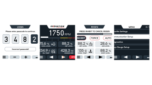
Joe: Modern HMI displays and controllers should be as intuitive as your mobile phone. If your interface requires a master’s degree to operate…you did it wrong! The unwritten expectation today is that most machine operators should be able to power up a machine and navigate through the controller menus without needing hours of training. The structure of menus, settings and the iconography used should be clear and obvious to anyone operating the machine for the first time.
Having the right partner for your controller needs is critical to a successful implementation. The combination of quality hardware and software design go hand in hand to provide a positive user experience and allow maximum productivity from your machinery. When you work with Enovation Controls or our authorized integration partners, you will receive a customized experience and will be provided with the display features you need for your equipment, so control is made easy.
Ready to implement these features in your next display project? Visit our displays page.


